Responsive design make-over for NiftyQuoter. And yes, it’s free!
This new-year we updated our proposal system to capitalise on responsive design. Like the plumber who’s taps at home never get fixed, it’s easy to keep so busy upgrading customer’s systems that you take longer than you’d like to do your own. But the time had come!
It’s time for responsive design
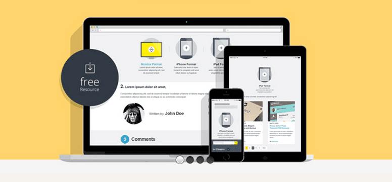
Our old system relied on Microsoft Office templates and PDF documents. OK in its day but long in the tooth now. The benefit of internet delivery using responsive design is compelling. Responsive design, sometimes called fluid design, enables your important documents to look great on both the desktop and on mobile devices. It makes anything more professional and readable no mater where you see it because the layout and display of your content cleverly adapts itself to fit.
We didn’t want to miss out any longer! After all, we had helped so many of our clients to do business anywhere, particularly with mobile friendly responsive websites and online apps. So we wanted them to be able to receive our proposals and sales quotes anywhere too.
The search for a suitable new system was an interesting exercise for an app builder like us. As you do, we first considered building our own system. But a brief search revealed two things. First the market already has a number of pretty polished contenders. So we’d have to invest heavily to get amongst the top three. Secondly, the current market price-point is about $15 to $25 per user per month. Therefore we could just use their systems much cheaper than investing in our own. Sometimes it’s better to outsource – even if you could DIY.
Don’t be the last one to upgrade to responsive design
So we reviewed a number of the recognised players. The remarkable thing was how few were responsive. I guess it’s an industry sector that moved to the net a few years ago, before responsive was so popular, and they’re only just starting to rebuild. What an opportunity for the forward thinkers to get the jump on their competitors!
So I emailed a couple of questions to what appeared to be the best responsive contender. They didn’t even return my email. Fail!
We then approached a mob called NiftyQuoter. It was a bit unusual, because their system wasn’t responsive out-of-the-box. But they have a generous system of templates where users can edit both the HTML (web page content code) and the CSS (web page styling code). Tick!
Openness towards responsive design CSS changes wins customers!
This openness means we were able to employ our CSS skills and make their proposals responsive. Keep that in mind with systems you use. If you have access to the CSS, there’s a good chance we can upgrade them to be responsive for a fraction of the cost of rebuilding the entire system.
Furthermore, NiftyQuoter’s co-founder, Klara Macinka, was very quick to answer my emails and has been very helpful. No surprise then she’s got our business.
Get plenty of fluids, free.
And of course we want to be helpful too. So I am offering here for free, the very same responsive CSS code we now use. Here’s the link: NiftyQuoter custom CSS for responsive proposals. Enjoy! We’ve just begun testing it and fine tuning it on a range of mobile devices. But, I’ll tell you more about that some other time 🙂
In conclusion, if you want to present better proposals and other web based content, and/or if you want the best-bang-for-you-buck upgrade, here are my 5 top tips:
1. Embrace responsive design. Your competitors are probably doing it now!
2. If there is already a range of great systems available in the cloud, don’t build your own.
3. Don’t waste time with services that don’t return your emails. You knew that already, I know.
4. When selecting a cloud operator, choosing one with CSS access gives you options.
5. If you have an existing system and CSS access – talk to us about an upgrade to responsive design!
Cheers!


